Quantcast
Channel: QGIS – Digital Geography
Viewing all 87 articles
Browse latest View live

ILWIS GIS – Tutorial I [Introduction]

$
0
0

Today I’ll start with a new series of tutorials for an open Source GIS called “ILWIS GIS“.

ILWIS is the short term for “Integrated Land and Water Information System” developed at the ITC Enschede and distributed under the GNU General public license as open Source GIS since 2007. It’s purposes is designed for geoecological questions. It can handle both, vector- and rasterdata.


ILWIS Logo

ILWIS


If you’re interessted in ILWIS you can download the newest version herehttp://52north.org/communities/ilwis/ilwis-open/download. The software package is available for the following operation systems: Windows and with the use of additional software on Linux and Mac OS X.

The language of ILWIS GIS is english. There a lots of portuguese, greek, italian and also persian scientists working on help files and tutorials. If you’re interessted in more information about ILWIS in one of these languages, please clickhere. ILWIS is a great GIS for teaching yourself because there are plenty of detailed tutorials available.

ILWIS has some difference to common GIS like ESRI ArcGIS or QGIS since a direct mapwindow is missing. But no worry, there is the possibility to open the layers in seperate mapwindows and combine them. The mapview reminds me on SAGA GIS. Another big point is the command line. All of the modules and many processes can be opened and definied using commands. So if you’re familiar to commands, it’ll be easy for you to start your desired process and calculations. What I really like in ILWIS GIS is that all your generated geodata will be labeled with the calculations donw/used modules and the parent files. So it’s easy to reproduce your workflow.

At the beginning, ILWIS GIS looks a bit old-fashioned. A smooth user-interface is missing…but let’s start with the opening of the software and some descriptions about the main workspace with some images.


ILWIS-workspace I

ILWIS-workspace I


The Screenshot shows you how your ILWIS GIS workspace looks after opening. It’s the main area where you work. The marked area

(1) let you change the visibility of your files in your directory. Right now, there are only 5 selected. These five are (from left to right): raster-, polygon-, segment(polyline)-, point-layer and additional attribute tables. Since ILWIS is a bit different to other GIS it stores domains and represantation in an extra file which can enable here (color palette). There is also the possibility to activate histograms, filters, map lists, etc. In the case that your desired files are not shown in the directory (area (3) your solution will be in this bar.

(2) is the command line. There you can call the modules or make calculations. We will focus on the line in the following tutorials.

(3) is your main workspace and shows you all your files in your directory. Which files you can see depends on the activation in bar (1). Like I have mentioned, ILWIS has a extraordinary way for saving parts of your data. Next to domains and representations there are also files for georeferencing and coordinate systems. It’s a bit tricky at the beginning to get familiar with it.

(4) the heart of ILWIS GIS is represented by the modules. You can either chose your modules in the ‘operation-tree’ (similar to SAGA GIS), search for specific modules using the ‘finder’, typing in a command, rightclick on the file or selecting the modules using the drop-down menu at the top of the screen named ‘Operations’.

Some of these modules will also be part of the next tutorials.

At the end I’ll show you the map-window which opens when you doubleclick to a file.


ILWIS-mapwindow

ILWIS-mapwindow

I hope you enjoyed the first introduction to ILWIS and download it for your first steps.


The post ILWIS GIS – Tutorial I [Introduction] appeared first on Digital Geography.


The new version of qgis2leaf

$
0
0

The last post about our famous qgis2leaf plugin showed a glimpse of what it is capable of: exporting all your features from a QGIS project to a working leaflet based webmap. Sounds great, huh? Well it is!


The new version

In the first version we just explored the workflow:

  • export the features to geojson with python and QGIS API
  • create files with python
  • GUI design
  • special character handling
  • and stuff …

In the newest version we offer much more possibilities for your data:

  • export polylines, polygons and points
  • dozens of basemaps available
  • define the icon to use for points
  • define the popup content for all shapes
  • preservation of styles as far as possible: colors, transparency (points, lines, polygons), width (lines, points)
  • definition of the extent

At the moment the plugin can handle categorized, graduated and single symbol styles.

See it here with a line example:

line feature qgis graduated

The line feature in QGIS wth graduated symbols

The exported map shows nearly same setup:

exported webmap with custom symbols with qgis2leaf

exported webmap with custom symbols

The same works for all the other feature styles.

Custom icons and popups

If you want to have custom icons and popups you need to tweak your layer a little. For custom icons you need to add an attribute called icon_exp. The provided link or absolute path to folder will define the image. PNG or SVG files will work fine:

custom icon for qgis2leaf

custom icon definition in the attribute table for qgis2leaf

And BAAM that is a fancy map:

custom icons in leaflet

custom icons in your leaflet webmap with qgis2leaf

Defining the popup content works similar. You just need to add the attribute html_exp and the value of this field will define the popup content:

popup content in qgis2leaf

popup content definition in qgis2leaf for your webmap

Instead of an ugly table holding all your data the popup can show some girly stuff or other information:

custom popup content in leaflet

custom popup content in your leaflet webmap

You can download the newest stable version 0.9 via the manage plugin dialog in QGIS. Ujaval Gandhi provides another great tutorial on this plugin on his site. If you see any issues please report them here or contact us via our contact form:

Name: *
E-mail: *
Comments:
Type the characters you see here:

The post The new version of qgis2leaf appeared first on Digital Geography.

Vintage Themed Maps in QGIS

$
0
0

Vintage Design in QGIS 2.2

Hello again! Thanks for taking a look at this post on how to create a Vintage Themed Maps in QGIS 2.2. Now for this process I am using QGIS 2.2 on Ubuntu 14.04, I only mention this because I have never compared the Linux and Windows version to see if there are any difference between the two versions. Furthermore, I would like to state that I originally the idea for this post from this Blog last year, so please take the time to look at it. Also, if you haven’t looked at my original post about Designing Vintage Themed Map with ArcGIS please take a few minutes and look at it to read about how I created the paper texture for my map. So being relatively new to QGIS and not using it every day I actually spent most of my time learning how to properly symbolize the Libya data that I used in my ArcGIS post. However, the learning curve was shorten considerably by watching the QGIS training videos that MangoMap created (and you can find those video tuts here), but being an ArcGIS/Windows dependent GIS dude for so many years I soon remembered some small things that I neglected to do before starting this task.

First, all my data was not in the same projection. ArcGIS re-projects the data on the fly for you and I just assumed that it was all in the same projection but I was wrong. Some of my layers only had geographic coordinate assigned to them (WGS 84 EPSG: 4326) and the rest of my layers were in Web Mercator Auxiliary Sphere. So I did a quick Google search to find out what the CRS was for Web Merc (which is EPSG: 3857) and BAM! I told QGIS what layers had the Web Merc projection and I was in business and all my layers were behaving correctly. Second, I never really worried what fonts are installed with Ubuntu, so I quickly found out that the ones that I used in my ArcGIS project are Windows default fonts (Segoe Print and Segoe Script) and Ubuntu doesn’t install them. However, this was solved by navigating to my HDD partition of Windows and finding the fonts that I used and installing them on my Ubuntu OS (thank God for the ability to Duel Boot). After finally getting all my ducks in a row with the projections and fonts, I was finally able to start symbolizing my data in QGIS Desktop. This did take a little time to complete, only because I am pretty picky with the colors that I like to use (I am still trying to find a blue that I can live with for large bodies of water). SOOO, after many different versions in QGIS Desktop, I was able to get a final map that I was happy with into the QGIS Print Composer project.

Vintage_QGIS_Desktop

Next I created a new Print Composer project within my QGIS Desktop project (this reminds me a lot like how the process was to create a map in ArcGIS 3.x, and I remember missing that process when ArcGIS 8 came out), and then started Labeling all the features with the same font set that I utilized in my ArcGIS project.

Vintage_QGIS_Normal00prctTrans

With everything labeled and my grid created, I started playing around the rendering options to give my map a vintage feel.  Thus, I added my paper image and ordered it behind my Map element, and then I started tuning the rendering. I personally found that the “Multiply” Blending Mode with 0% Transparency created the most clear vintage themed map.

Vintage_QGIS_Multiply00prctTrans

However, having spent some time in map libraries, I must confess that I really like how the map looked with the Blending Mode set to “Burn”. It really did create a nice looking aged/damaged map that reminds me of so many that I have seen at some really old libraries. When I look at this map below I can almost feel the dirt on my fingers. .  Smell the mold in the stale air of an ancient library basement. And scanning maps all day with out a break with commander “Dewey” leading the collection operation! Ahhhh! Now that’s what I call fun!

Vintage_QGIS_Burn

Well I guess I digressed a little there. So in summary I really found it easy and navigate the labeling and overlays on the composition, but I must say that the labeling is not as advance as ArcGIS. I may be mistaken, however, I could not find a way to create curve text, I know I must sound spoiled, but I really do like that functionality within ArcGIS Layout labeling.  With that stated that was the only issue what I really faced while creating these maps. I think that QGIS has a really good and basic set of tools for GIS professionals to utilize when creating their maps.  It makes me really excited to see what new versions of QGIS will give us with newer releases. Ciao!

The post Vintage Themed Maps in QGIS appeared first on Digital Geography.

Top 5 QGIS Plugins

$
0
0

I have been using QGIS 2.2 for most of my GIS work for about 3 months now, so I have noticed that I keep on using some plugins over and over and I really wouldn’t be able live without them. So here is a list of my favorite top 5 QGIS plugins!

Top 5 QGIS Plugins

1. OpenLayers plugin

It was love at first use for the OpenLayers plugin.  It allows the user to load basemap from a different provides like Google, Bing, Yahoo, OSM (OpenStreetMap), Apple (I have NO idea what someone would want it) and Stamen.

OpenLayers01

OpenLayers Plugin – Basemap List

Now I do have some issues with it sometimes, but mainly the issue is that my main map is not in Web Mercator Projection. Once I change it to the QGIS Web Mercator Projection everything is fine, and in QGIS this projection is called WGS 84/Pseudo Mercator EPSG:3857.

OpenLayers02_GoogleHyb

OpenLayers – Google Maps Hybrid

2. GeoSearch

I really like GeoSearch plugin mainly for a quick search for locations during my analysis projects, but it does a lot more than what I usually utilize it for.  Apart from just simple search for a placename (from a good list of sources I might add) you can also calculate distances and calculate driving routes.

GeoSearch Plugin

GeoSearch Plugin

When searching for a placename in the GeoSearch tool you can specify what Geocoder you want to use and if you only want One Result.  I usually like to see what other locations there are when I’m searching for a placename so I usually want to see them all (who knew ther was a Washington, UT? Well I guess people in Washington, UT, but I sure didn’t).  When the results of your search are returned, they are added to your map canvas as a temporary layer.

GeoSearch - Routes

GeoSearch – Routes

I really like the Routing option that is in this plugin. It seems to be using Google Maps for it road network, but I cannot verify this, and it gives you the options to choose your mode of transportation, and to avoid tolls/highways.  This is a great plugin and I really think that is a must add plugin for anyone who uses QGIS on a regular basis.

3. qgis2leaf

I know this has gotten a lot of press (link to a great write up here or here) so I will not spend that much time on it, but seriously I cannot write about QGIS Plugins without mentioning the AWESOME qgis2leaf.  When I first started using Leaflet I didn’t know shit about JaveScript, but not knowing something has never stopped me from trying. So with a lot of blood, sweat, and maybe some tears, I was finally able to get a web map up. I would have LOVED to have this as an option when I was first starting to learn JS and Leaflet, but never the less, I am very happy it is around now.  So, two Geo-Geek Thumbs Up to the qgis2leaf Plugin.

qgis2leaf - Export

qgis2leaf – Export

4. fTools

This Plugin is a must have to working with Vector Feature Data.  This adds multiple sub-menus to the Vector menu with some tools that are very helpful for analyzing and manipulating vector feature data.

fTool01

5. MMQGIS

Last but not least, MMQGIS. This plugin has a lot a very useful tools when working with vector features.  The most useful tool in my opinion is the Geocoding tools.  MMQGIS allows you to geocode places utilizing Google Maps or OpenStreetMaps geocoding serviece (a detailed geocoding “how-to” can be found here). This is one plugin that I always add when I install a new instance of QGIS.

MMQGIS

One Plugin to Watch-QGIS to OpenLayers 3

I was introduced to this plugin just yesterday, and I knew I needed to include this in my post. It has a very nice user interface and I really like the Preview option that it has. I didn’t include this as one of my top 5 plugins just because its still in active development, its only been on GitHub for 5 days. I manually installed this plugin from the code obtained from GitHub (link here) and not the QGIS Plugin Manager (and if you do not know how to manually install plugins then here is a link).

QGIS to OpenLayers 3 - with preview mode on

QGIS to OpenLayers 3 – with preview mode on

I’m really excited about how developers are finding new ways to extend the functionality of QGIS.  Happy Mapping!

The post Top 5 QGIS Plugins appeared first on Digital Geography.

reproject and filetype change in python/pyqgis for QGIS plugin

$
0
0

In my current work on the qgis2leaf plugin I had the idea to place raster data on a leaflet map as an image overlay. With this in mind and looking at a webmap I needed to consider a good filesize, a strict projection of EPSG:4326 and a strict filetype as well. So decision was: projecting everythin to EPSG:4326 and changing file type to *.jpg. I know, how to do this in the Terminal and in QGIS. But what options do you have using python/ pyqgis only?

Terminal

For doing this work in the terminal/shell/command line the one and only choice is called GDAL. You can install this nice set of functions on every OS (see instructions here). Once you have what you need the repojection and filetype change is done with a one-liner:

gdal_translate -of jpeg -outsize 100% 100% -a_srs EPSG:4326 RASTER_NAME_IN RASTER_NAME_OUT

If you want to call this from inside of Python everyone states to use subprocess:

import subprocess
subprocess.call(["gdal_translate","-of","jpeg","-outsize","100%","100%","-a_srs","EPSG:4326","RASTER_NAME_IN","RASTER_NAME_OUT"], shell=True)

Despite the argument shell=True is a security problem, the above line of python code worked only on Ubuntu in my case. In Win and Mac it only worked when I provide the whole path to the executables of GDAL. As this depends on the OS and the user/pc this wasn’t an option to create reprojected jpgs in a QGIS plugin. As I wasn’t able to determine the GDAL installation path I was somehow stucked. So I looked back at QGIS.

QGIS

In QGIS 2.0.1 an above you have several different options to reproject a raster file:

1) the GDAL_translate dialog. You can find this in Raster->Conversion->Translate which calls the above described function gdal_translate directly via shell/terminal/command line and import the result to your QGIS library.

GDAL translate jpg

GDAL translate dialog with “save as” JPG option

2) the GDAL warp dialog. With this dialog you can reproject rasters via Raster->Projections->Warp. It is also possible to save the result as a jpg. So it is quite comparable to GDAL_translate:

GDAL warp dialog QGIS

GDAL Warp dialog

But above options depend on the GDAL tools plugin which needs to be installed. Unfortunately I don’t know how to call those scripts from inside my plugin… So there must be another solution.

3) The processing toolbox. Together with QGIS 2.0.1 the former Sextante toolbox was implemented into QGIS itself. That means it ships together with QGIS already. And the next advantage is: you can use it out of the python terminal. Processing offers access to GDAL functions as well:

GDAL warp in processing toolbox

processing version of GDAL’s warp function

The only problem with processing and it’s implementation of warp and translate function: You can’t save it as JPG files…

Result

So now I use a combination of processing and the GDAL Python bindings (somehow a translation of GDAL to work in Python only):

import processing
from ogr import gdal
processing.runalg("gdalogr:warpreproject","RASTER_NAME_IN","EPSG:XXXX","EPSG:4326",0,1,"","RASTER_NAME_TMP") # this uses the processing version of the warp function from GDAL
format = "jpeg" #define the driver extension that is needed in the end
driver = gdal.GetDriverByName( format ) #define the driver that is needed in the end
src_ds = gdal.Open(RASTER_NAME_TMP) #open the temp raster which is now in EPSG:4326
dst_ds = driver.CreateCopy( RASTER_NAME_OUT, src_ds, 0 ) #creates a copy in the jpg format
dst_ds = None #free the dataset	to save it 
src_ds = None #free the dataset to save it

And that’s it. If you know other alternatives, drop us a line…

The post reproject and filetype change in python/pyqgis for QGIS plugin appeared first on Digital Geography.

regular spaced points… interpolation madness…

$
0
0

The geodata department of the city of Berlin offers a great portfolio of free geodata for everyone to use. One dataset is the result of some LIDAR measurements and is offered as a txt with x,y and d values. This is commonly known as xyz data but should not be mistaken as a simple whatever-delimited text file. This dataset is regular spaced and therefore can be threatened easily with QGIS. But let me first show you some interpolation results which can be produced as well.

Interpolational madness

If you want to create raster data from a point shapefile or a list of coordinates you normally think in the direction of TINs, IDW, kriging, and other more or less advanced interpolation techniques. QGIS offers TIN and IDW out of the box. As I was afraid to select the whole 2.5GB point shapefile as input, I’ve tried with a small subset of points. But first: what does the data look like?

LIDAR txt file

xyd data from LIDAR@Berlin. Notice the right white column … 35.000.000 points…

Looking at it I was frightened… 35.000.000 data points. How can I convert it to a raster using my Mac and not this beautiful Tianhe-2? This is what it looks ones it is loaded into QGIS:

35.000.000 points added to QGIS subset points in QGIS

I was sure that interpolating this amount of data was a problem. My first try was done with a small subset. The interpolation methods IDW (inverse distance weighted) and TIN (triangulated irregular network) are placed under Raster->Interpolation after you’ve added the Interpolation plugin which is shipped with QGIS. As this workflow is not correct I’ll just show you some results for this small subset:

Click to view slideshow.

The IDW looked best to me, but it was also very lame in computing. And thinking about it once more: I don’t need to interpolate!

Grids are your friend

So I’ve searched the web and gis.stackexchange.com was once again my friend. Once you’ve added your points to QGIS go to Raster->Conversion->Rasterize an fill in the parameters you think are right:

raster creation from regular spaced points

parameters for raster creation

And the results for the subset were created fast and they look much better than the IDW method which took much longer:

graduated mareks in qgis IDW weight 2 in QGIS rasterized point shapefile in QGIS

I’ve learned: keep it simple to get best results ;-)

The post regular spaced points… interpolation madness… appeared first on Digital Geography.

QGis Tutorial: webmap creation with QGis, QGis2leaf and GoogleSpreadsheet

$
0
0


Introduction

This tutorial will explain you how to create your own, interactive webmap in a fast and easy way! Such webmaps are used zo visualize e.g. adresses on digital maps. I’m using QGis 2.4 + Qgis Plugin Qgis2Leaf, google spreadsheet and a macro, wich I’ll tell you later about.

1.Data Preparation

The first step contains the data preparation. The easiest way to do that ist creating a spreadsheet with the needed columns. To realize the transition between a spreadsheet and a webmap, we need geocoded adresses, wich we will create automatically by a google spreadsheet macro. To make this operation run we need the columns called “location”, “lat” and “lon”. Fill up the column “location” with your adresses, let the “lat” and “lon” columns empty. Of course you can already fill up your further columns with information (have a look at picture 1).

Picture 1

Picture 1

2.Geocoding by using macros

Let’s have a look at the mentioned “macro” tool. Follow this Link, Riccardo already summerized, how to add this cool geocoding tool to your google spreadsheet and how to use it. Important hint: don’t use the fullHD page width of your browserwindow by visiting Digital-Geography, otherwise it could happen, that you can’t copy the entire source code ( a tiny bug of the new Digital-Geography.com fullscreen-Design :p)

3.Import to QGis

To be able to import your google spreadsheet content to QGis, you need to export it as an csv data file. To do so click “file > download as” and select the csv shape. Now open QGis, at the left edge (when you’re using the standard array, it’s also highlighted in the picture) you see a big blue comma, click this symbol to open the next window (look at pic.2) here you can selcet your csv file.

Picture 2

Picture 2

Click “OK”, a second window should appear right now, click “OK” a second time (“lat” and “lon” are automatically recognised by QGis as coordinate columns).

Picture 3

Picture 3

When everything worked fine, you should see the markings of your geocoded adresses in the output window.

4.Label styling

Of course you can use the labels given from QGis, but if you want to use your own ones, you should know that QGis2leaf doesn’t support svg-files at the moment. An easy alternative to use individual labels is to add a “icon_exp” column, in wich you have to quote the file path of your picture, label or icon (highlighted in picture 4). Watch out Windows-user! You have to swap the slashes, use such “/” instead of “\” those.

Picture 4

Picture 4

5. Export via Qgis2Leaf

Due to the wonderful plugin QGis2leaf, it isn’t neccessary to have Javascript knowledge, to generate an initial webmap. As you see on the picture, you find the plugin by hitting the buttons “extensions> manage and install extensions”.

Picture 5

Picture 5

Now a window is opening. Search for “QGis2leaf”, install, and here you go. Your toolbar is extended by a very usefull function!

Picture 6

Picture 6

Here you can see a map with a standard label:

Bild_7

And here is one with an own label:

Bild_8

Something more about Qgis2leaf.

The post QGis Tutorial: webmap creation with QGis, QGis2leaf and GoogleSpreadsheet appeared first on Digital Geography.

create point density raster in QGIS

$
0
0

In some applications you want to calculate the density of points. It sounds very easy and in fact it is using QGIS. Let me show you how. Especially, let me show you how to do this with the heatmap plugin in QGIS.

Prerequisities

You will need the common installation of QGIS 2.0.1 Dufour and an installed heatmap plugin (see how to install a plugin here). We will use some field data from Indonesia with 500.000 data points. You may download the data (12MB) we will use here.

The doing


Fire up QGIS and set the CRS of the project according to the used CRS in your data. In our case it is WGS84 Zone 49S which is EPSG:32749 and use the Layer->Add Delimited Text Layer function to add the downloaded test data to your project:

csv txt add QGIS

dialog to add a delimited text file as data source

I’ve chosen to create a spatial index as it improves the handling of this more or less bigger dataset. After this you need to determine the CRS of the data itself:

CRS data source

specify the CRS of your data source

Now your project should look like this:

points in a qgis project

project after adding of points

Creating a point density map is the purpose of the heatmap function/plugin. As you might have this installed prior you should follow Raster->Heatmap->Heatmap. We need to fill the parameters for the heatmap:

paramters heatmap plugin QGIS

parameters for heatmap plugin

I’ve changed the standard parameters a little. The colums Output raster and Output format should be clear. Avoid some special ooutput formats and try to stick with standard GeoTIFF as it is recommended by the author Arun. Radius is the radius to search for points around a location in m or map units (in our case it’s meters as we are using a projected Coordinate Reference System (CRS) with a base unit of m). As we are using the Quartic (biweight) kernel it defines the direct distance to the point itself. I am using 564m as the radius so I can easily state that the values in the raster describe the density for a square kilometer. By using a different kernel this could change as the form of the kernel changes. The Quartic (biweight) seems like a circle kernel.
The rows and columns as well as the cell sizes determine the spatial resolution of the target raster. The finer the raster the longer it takes to compute the raster. Keep this in mind. There are also more parameters to adjust but you may want to press the help button to get some insight in the functionality of the plugin itself.

The results

The resulting map is an image going from black (means small number of points around) to white (large number of points around the given location). We will change this to be more informative. First open the properties of the raster go to the histogram tab and compute the histogram. You will see that the curves reaches till approx. 13 on the x-axis which means that the highest values are about 13 points per km²:

histogram raster qgis

histogram of the result raster

We will use this value in our Singleband pseudocolor representation. Therefore switch over to the Style tab and change the Render Type to Singleband pseudocolor. I am using the color ramp YlOrRd and set the Max value to 13. After this click on Classify and on Ok:

style raster QGIS

style tab selections for raster representation

By using the identify results button you can now check the value at each location:

heatmap point density QGIS

heatmap result in QGIS

You may ask, why the values are not integer. According to the filter we have used, points near a certain location have bigger influence than points far away a given location. So the points are weighted in their influence. This is useful as we might have an underlying uncertainty in the location of points. But if we have several points near each other it should be more certain that the point locations are reliable.

More steps?

For visual impression I like to see some indicators where the values change. Therefore I am using the Contour function in the Raster dialog. The contour creation function is part of the GdalTools plugin by Faunalia. Well the name Contour is a little critical. Basically this function takes a raster image and creates lines of identical values. In our case it is the point density. Go to Raster->Extraction->Contour:

iso line contour in qgis

iso-line creation in QGIS

The interval is set to one and I also would like to have a new column in the line shape file where the value of the current line is stored. The results are better to interpret afterwards. You can easily see the slight right orientation of the data:

results raster iso lines contour QGIS

results with iso lines in QGIS

The post create point density raster in QGIS appeared first on Digital Geography.


QGis Tutorial: webmap creation with QGis, QGis2leaf and MMQGIS

$
0
0

Introduction

This tutorial will explain you how to create your own, interactive webmap in a fast and easy way! Such webmaps are used zo visualize e.g. adresses on digital maps. I’m using QGis 2.4 + Qgis Plugins: Qgis2Leaf and MMQGIS.

1. Data Preparation

The first step contains the data preparation. The easiest way to do that ist creating a spreadsheet with the needed columns. To realize the transition between a spreadsheet and a webmap, we need geocoded adresses, wich we will create automatically by the MMQGIS Plugin. To make this operation run we need the columns called “address”, “city”, “state” and “country”. Fill up the columns “address” and so on with your data. Of course you can already fill up your further columns with information (have a look at picture 1).

2. Geocoding adress-data by using MMQGIS

Let’s have a look at the mentioned MMQGIS-Plugin. You can install it by clicking on the addon-button in QGis and type MMQGIS. Install it and go to the new menu “MMQGIS – Geocode – Geocode via Google or OSM”. Now choose your csv-file from step 1, set the data-headers (picture 2) and select the OSM geocoder (if you geocode your addresses with Google you have to use google maps as base layer).

Picture 2: MMQGIS Geocode Options

Picture 2: MMQGIS Geocode Options

Click “OK” and the geocoding will progressing. Finally you get a new layer in your QGis project, which we use for creating our webmap.

Picture 3

Picture 3

When everything worked fine, you should see the markings of your geocoded adresses in the output window.

4. Label styling

Of course you can use the labels given from QGis, but if you want to use your own ones, you should know that QGis2leaf doesn’t support svg-files at the moment. An easy alternative to use individual labels is to add a “icon_exp” column, in wich you have to quote the file path of your picture, label or icon (highlighted in picture 4). Watch out Windows-user! You have to swap the slashes, use such “/” instead of “\” those.

5. Export via Qgis2Leaf

Due to the wonderful plugin QGis2leaf, it isn’t neccessary to have Javascript knowledge, to generate an initial webmap. As you see on the picture, you find the plugin by hitting the buttons “extensions> manage and install extensions”.

Picture 5

Picture 5

Now a window is opening. Search for “QGis2leaf”, install, and here you go. Your toolbar is extended by a very usefull function!

Picture 6

Picture 6

Here you can see a map with a standard label:

Bild_7

And here is one with an own label:

Bild_8

Something more about Qgis2leaf.

The post QGis Tutorial: webmap creation with QGis, QGis2leaf and MMQGIS appeared first on Digital Geography.

Military Expenditure on a map

$
0
0

Statistical data for a geographer is fun! War is not!

Regardless what you think of the military it never hurts to be informed, so… Lets play a bit with military expenditure statistics.

I’m using data from SIPRI (Stockholm International Peace Research Institute), which covers military expenditure for regions and countries based on for instance GDP.

Screenshot from 2014-07-17 11:09:34

The data is in Excel format (.xlsx) which is a problem for QGIS, so it has to be converted to a format that QGIS understands. First however some other issues must be addressed.

In order to use the years as field names they must be changed so that they do not start with a number. I’ll simply add the letter “Y” in front of all years.

In the table there are also some fields that contain non-numerical values to represent “Data Unavailable”, which is bad from a GIS perspective. For it to work I replace all non-numerical values with “99″ for unavailable data and “98″ for countries that didn’t exist at the time. These numbers can be filtered out later in QGIS. I also remove the “Notes” column, which contain a lot of weird characters and links.

I chose to save the sheet as comma separated textfile (CSV). In my case the text file also needed some attention before it started to work. It worked better with decimal points than the standardized decimal comma and comma separated text worked better than tab separation. These changes was easy to do in a text editor, just don’t try to replace the tabs with comma first and comma with point later…

Screenshot from 2014-07-17 12:00:20

Using the “Add delimited text layer” button and selecting “comma separated values” without geometry (and some other settings to get the correct field names) it is possible to import the data into QGIS.

To display the data you also need some polygons. If you have current data use that, but if you don’t here’s a link to some free data (link).

License (CC BY-SA): The world data is in shape format and dated 2008. Border changes since then is obviously not included, and as stated on the site some borders are also disputed. Use the data with caution. Data provided by Bjorn Sandvik, thematicmapping.org.

Unfortunately not all polygons represent a country and not all countries are spelled the same way in the two files.

Screenshot from 2014-07-17 11:51:01

When you create the join (layer properties – Joins) you can use a simple style to visualize which countries are missing data and fix this in the text file by editing the country name so the same names are used in both files.

Screenshot from 2014-07-17 13:44:38

After a lot of problems with converting text to decimal numbers (probably a QGIS bug concerning decimal character settings), I got a map showing military expenditure as percentage of GDP (above).

Using the same technique with expenditure per capita gave a different result (below).

Screenshot from 2014-07-17 14:13:01

So, now what? What if I create a “quota” from the two results that is based on a ranking (percent of highest value) and add those together?

The countries that spend more per capita as well as compared to GDP will get a higher quota…

Screenshot from 2014-07-17 14:34:15

The darker the colour, the higher the quota.

If someone object to “adding” the ranking here’s the same where the ranking is multiplied.

Screenshot from 2014-07-17 14:34:38

Multiplying is dragging the scale apart some more.

Well then, what good is all this then?

I don’t know… all I’m interested in is working with GIS and statistical data. Now it’s up to you to draw any conclusions based on the result, or create your own analysis with this or any other data you find interesting.

Some conclusions from a QGIS point of view:

  1. As with most software there’s a problem with the use of decimal character in QGIS. You can’t predict everything, but you should know what works and what doesn’t. Right now I’m not sure what is the right way to do this.
  2. If you want to make a “feature subset” using a query, you can not have table data joined to the feature. Remove the join first.
  3. Statistical data is fun, but dangerous! Be careful with what conclusions you make based on your analysis.

The post Military Expenditure on a map appeared first on Digital Geography.

Exploring OSM Israel/Palestine

$
0
0

In this post I’ll show how to explore (or data mine) Open Street Map data and use features off-line that normally can be hard to get.

Many use http://download.geofabrik.de to download zipped shapefiles to be used directly in GIS systems, but are surprised when it does not contain as much data as the same area in Open Street Map on-line.

You can still use geofabrik.de but download the *.osm.bz2 files instead. They include raw data from OSM that needs to be processed in order to be used in QGIS or other GIS applications.

In QGIS there’s a tool in the Vector menu called OpenStreetMap that can download and process small areas with OSM data, but for data covering a whole state or nation it doesn’t work. The tools for “Import” and “Export” of topology however, does work.

Screenshot from 2014-07-27 10:25:23

Data above is from gadm.org.

To exemplify I’m downloading data covering Israel and Palestine, partly because I want to know more about the geography, but also because there are a lot of confusing (for me) symbols that are not explained (link) in Open Street Map.

After downloading and extracting the Israel-and-Palestine.osm.bz2 file I use QGIS to import topology from the *.osm file.

Screenshot from 2014-07-27 11:03:15

The next step is to “Export” the topology for points, lines and surfaces to a SpatiaLite database. This is done with the third option in the VectorOpenStreetMap menu.

Screenshot from 2014-07-27 11:25:11

The tool can only “export” topology for one geometry type at a time, so you may need to run this tool many times to import everything you need.

In my example here I’ll skip the creation of attributes since I’ll use the data in another way but if you want to use the attributes you will need to use the “Load from DB” button and select the attributes you want to add (there’s a lot of them).

Screenshot from 2014-07-27 11:34:34

The completed import/export gives me a lot of points, lines and polygons as well as some not entirely useful tables (picture above).

Now its time for the magic.

For each layer I create an “action” under the respective layer properties.

Screenshot from 2014-07-27 11:38:22

Picture above shows action for point layer.

All actions are of type “Open” and the action for the point layer is:

http://www.openstreetmap.org/node/[% "id" %]

And for lines and polygons:

http://www.openstreetmap.org/way/[% "id" %]

When I now use the “Run feature action” tool on either the point, line or polygon layer, I get a web page with the feature highlighted and explained with all available data.

Screenshot from 2014-07-27 12:06:41

In this view I can see that the mosque is of Sunni denomination.

It’s also possible to find objects that is not visible in the “official” Open Street Map this way.

Screenshot from 2014-07-27 12:05:43

Like the “Bait Iksa Council” building above, or the “Ajaj Taxi” below.

Screenshot from 2014-07-27 12:07:25

Now I have a useful tool to dig deeper into the Israel – Palestine conflict, at least geographically.

Some caution though. Anyone can edit Open Street Map, and no one is obliged to do so. Therefore it’s much like Wikipedia and you need to be critical to any and all information you find. It can be helpful to trace edits of a certain feature to see if there are difference of opinion.

The method described here will help you do exactly that.

The post Exploring OSM Israel/Palestine appeared first on Digital Geography.

Creating models in QGIS

$
0
0

You’ve probably heard of model builder in ESRI ArcGIS (even used it?), but did you know the same functionality is available in QGIS?

Screenshot from 2014-08-01 12:34:51

Image showing the “Processing Toolbox” in the background right and the “Processing modeler” in the front.

In my example I’ll be building what should be a very simple tool that extracts points at a maximum distance from some lines, but it has a complication due to a bug in QGIS. However there’s a fix explained on the QGIS hub (link). You should basically edit a script file (python/plugins/processing/algs/qgis/ftools/ExtractByLocation.py) moving and changing the code according to this:

Screenshot from 2014-08-01 12:43:20

Remove text in red, replace with text in green, save your file and restart QGIS (backup the file before you edit).

(This may be fixed when you read this article)

Back to business

You start the “Graphical modeler” under the “Processing” menu (the window title is however “Processing modeler” as in the picture below).

Screenshot from 2014-08-01 12:48:16

Adding “Inputs” to your model.

Start by adding “Inputs” to your model, and in my case I’ll be using two vector parameters (one point and one line) and a number parameter for the distance. If you click on the “Edit model help” button you can add more details and help for the tool, but it’s not necessary.

By the way, QGIS tends to crash extra often when you use the modeler so name your model and save often.

Screenshot from 2014-08-01 12:58:02

Models are created by connecting inputs with algorithms resulting in outputs.

I’m using the “Fixed distance buffer” and “Extract by location” tools to first create a buffer around my lines at a given distance and then extract the points that are within that distance.

There’s more to this than what’s visible in the picture above or in the text, but it should be pretty self explanatory.

Use the search field in the modeler to find the tool you’re after. Some functions can be found in many places depending on which extras you have installed in QGIS, and they work in slightly different ways.

You can run the tool from the modeler directly, but normally you will run it from the “Processing Toolbox” where it’s been saved under “Models”.

Screenshot from 2014-08-01 13:49:44

The MyDistanceTool dialog and the result in the background highlighting all points within a distance of 200 meters from the lines.

You can also share your model file with others and there’s a special tool in the toolbox for adding models from a file.

Reflections

QGIS is a bit shaky with the toolbox and modeler, mainly because the underlying tool scripts are a bit “iffy” sometimes. It should clear up eventually, as long as we keep reporting the bugs we find.

Since QGIS does not use a “unit” when entering a distance you need to use the same unit as the layer CRS. The easiest way is to use only projected data in projected projects for this to work (I’m using a Swedish national projection in my example). If you use un-projected data the given distance will be interpreted as degrees (200 degrees is a lot more than 200 meters).

You can run the model without loaded data, which also limits which tools can be used in the model. In my case the “Select by location” tool might be useful, but since selections doesn’t work with data that isn’t loaded it’s excluded from the modeler.

You can even use your own models inside other models and thereby create more complex models from simpler ones.

A nice feature is to define a QGIS layer style file (*.qml) for the resulting layer. You do this by right clicking on the tool in the toolbox and selecting “Edit rendering styles for outputs”.

Good luck, and don’t forget to report your bugs!

The post Creating models in QGIS appeared first on Digital Geography.

QGIS 2.6 – Sneak Peak

$
0
0

The release of QGIS 2.6 is planned for October 24, but you don’t have to wait to test new functions in development.

In this post I’ll look closer on two new features that in my mind will make GIS life easier, even if some improvements should be made with the first of the new features described here.

Independent Grid (Print Composer)

Composer

To me, this is proof that you can change things by reporting bugs and requesting features. This is a feature that I’ve requested myself (among others – link), which now at least partly has been implemented into QGIS master (the name for the development version of QGIS).

Grids in the print composer can now be added independent of the projection of the map, and you can add as many grids you could possibly want.

However, be careful when you pan the extent of the map to close to the projected grid boundaries. I’ve crashed QGIS quite a few times this way.

In my feature request, which now unfortunately has been closed, I also requested a way to format the grid labels so that a definable number of most and least significant digits could be omitted. This way I wouldn’t have to print “6582000″ when “82″ would be enough, as long as I could include a complete coordinate label in one or more selectable corners (so called corner labels).

Anyway, this is in my opinion a great improvement to QGIS Print Composer.

(By the way, can you spot something weird with the lat/long grid in the picture above?)

Colour Picker (I’m using the Queens English)

The new colour picker will make it a lot easier to select colours, especially to re-use previous colours.

Picker

As before you can pick a colour freely by clicking the colour button, but the right-click menu has been removed. Instead you have a small button to the right of the colour that gives you the option to copy and paste as well as select from recently used colours or a set of “Standard colors”.

Default

The standard colours can be edited in the settings ( Settings – Options ). Not only can you add and remove colours, you can also name them to your content. Your personal standard colours can then be shared by import/export functions (GIMP Palette *.gpl).

Changing colour names may not be revolutionary, but I think you could at least provoke a smile or two.

The post QGIS 2.6 – Sneak Peak appeared first on Digital Geography.

digital’s digest – 37/2014: compare google with OSM, balloon and kite Mapping, rectify maps online, load OSM tiles in QGIS, High Road OSM filter

$
0
0

Digital’s digest – This new post series gives you a weekly overview about new exciting geo-, project- and gis-links. We should write about a special link? Please submit it in the comments.

Find former tips here:
Digital’s digest 1 to 5

6. Compare Google with OSM mapstyles on sauter.com

If you want to compare different webmap styles (background tile services) you can whether use mapcompare or the hint of Simon Schmidt: sautter.com. Within an open layers framework you’re able to chose a ground layer (Google Streets, MapMaker, Aerial, Physical) and overlay this with open data mapstyles like OSM Mapnik, Mapnik german style, OSM CycleMap, Mapquest, Hillshading, Hiking Map and the ADFC Bicyclenetwork. With a transparency shifter you can fade the overlays opacity from 0 to 100 % and see clearly the differences between the styles. Check out the pictures.


before displaying the overlay

before displaying the overlay

after displaying the overlay

after displaying the overlay


Follow the Link to do your own comparison.

7. Balloon and Kite Mapping Kit + Map Knitter

Remote sensing is an expensive thing to undertake. With raising UAV technologies and a growing community little companies and mapping addicts can afford UAV imagery shots with cheap hardware as well. Particularly the Balloon and Kite Mapping Kit from PublicLab is a really nice project in my opinion. With this kits you can build your own DIY (do it yourself) mapping balloon or kite and get a camera for mapping issues in the air. With the related software Map Knitter – “Turn images into maps” taken pictures could be stitched and processed as real aerial imagery.


Even little scientists can start with aerial imagery.

Even little scientists can start with aerial imagery.

Balloon mapping in action.

Balloon mapping in action.

Results of a balloon mapping.

Results of a balloon mapping.


All pictures are from publiclab.org and its subsites.

Follow the link to get more information about balloon / kite mapping and the image processing webtool mapknittr.

8. Rectify maps online

You’ve got (old) paper maps? Maybe it would be interesting to use them in a GIS or as a georeferenced image for certain ideas! Mapwraper.net from the New York Public Library is a free and open source georectification and map hosting service. By the way you can browse about 2600 georectified and unrectified maps, upload your own maps and find some overlays (vector data). Additionally there is the possibility to export maps as GeoTiff, rectified PNGs, KML, WMS and !!! as Tiles. I think it’s a great idea and a nice collection, please go on mapwraper.net.

Map example on mapknittr.org

Map example on mapknittr.org

Try the free rectification service here!

9. Load OSM Tiles in QGIS

Inserting an OSM background layer in QGIS isn’t that hard with the well-known OpenLayers Plugin. If you want to show some custom tiles from your own server for example, you need another way to load this tiles into QGIS. GDAL shows a dummy and gives help to write a xml-file to create your own GDAL WMS raster-tile file, which streams your tiles into QGIS. Have a look at the code or use this example (save it to a xml-file and import it as a raster-layer in QGIS)!

<GDAL_WMS>
    <Service name="TMS">
        <ServerUrl>http://tile.openstreetmap.org/${z}/${x}/${y}.png</ServerUrl>
    </Service>
    <DataWindow>
        <UpperLeftX>-20037508.34</UpperLeftX>
        <UpperLeftY>20037508.34</UpperLeftY>
        <LowerRightX>20037508.34</LowerRightX>
        <LowerRightY>-20037508.34</LowerRightY>
        <TileLevel>18</TileLevel>
        <TileCountX>1</TileCountX>
        <TileCountY>1</TileCountY>
        <YOrigin>top</YOrigin>
    </DataWindow>
    <Projection>EPSG:900913</Projection>
    <BlockSizeX>256</BlockSizeX>
    <BlockSizeY>256</BlockSizeY>
    <BandsCount>3</BandsCount>
    <Cache />
</GDAL_WMS>

10. High Road OSM filter

Styling the awesome datasets from OpenStreetMap can be hard if you want to have a compromise between seamless line-networks and a generalized mapping. To get a proper result you’ll need good filter and styling rules. There are some general approaches like OSMBright and specific ones like our “Digital’s digest” nr. 10 – the High Road OSM query.


The HighRoad query for great OSM road styles.


When you have some interesting experience (finished projects) with this approach of road styling, please comment. Here you get to the HighRoad OSM query made by migurski.

Last Week

1 – 5: digital’s digest – 36/2014: download tiles, big maps from tiles, osm city plan, fictional maps and tiled pictures

The post digital’s digest – 37/2014: compare google with OSM, balloon and kite Mapping, rectify maps online, load OSM tiles in QGIS, High Road OSM filter appeared first on Digital Geography.

QGIS 2.6 Feature Freeze

$
0
0

Are you curious about QGIS 2.6? Well on Friday (9-26) QGIS development goes into feature freeze and focus will shift towards fixing bugs and enhancing stability. What can we expect from the upcoming release. Read on to find some interesting news.

Firstly, I’ll apologize for using screen caps in Swedish, but the pictures are from a similar article I’m publishing on my regular blog tomorrow (Monday).

I’ve previously presented some new features in QGIS 2.6 (link to article) but what else is new?

I don’t keep track on every improvement, but when testing the development version it’s easy to find some interesting differences, most of them will likely be implemented in QGIS 2.6. Here’s a short list.

1. Python Parser

If you are writing Python script that runs automatically when a project is opened, saved or closed, you will now get additional help with row numbers and a syntax parser.

2. Geometry precision for QGIS Server

This is important for all who use QGIS Server and projected coordinate systems. By setting a limited number of decimals in the coordinate you can significantly reduce the bandwidth for the requests. Why should you need decimals anyway when the coordinate unit is meter?

3. Project colors

As mentioned above I’ve shown this previously, but it deserves to be mentioned again. It isn’t just general colors that can be defined, but as Mathieu pointed out in the comments in my last post you can define the custom colors also on a project level. The color definitions will then be included in the qgs file.

4. Print Composer

Here we’ll find a lot of news, not only the possibility to have multiple grids of various coordinate systems (previous post).

You are no longer limited to Zebra as a grid frame. You can also choose nice frames for your maps.

If you have a lot of maps in your layout, it’s now possible to have them all appear in a single overview map as shown in the picture above.

You can also change the secondary color in scale bars of the type in the picture above. Previously it was only possible to change the primary color and the secondary would always remain white.

Properties for arrows and tables have also been overhauled, as well as HTML windows. Here you can now define styles for the HTML content, which gives you the possibility to adjust the appearance to the rest of your layout. There’s also increased possibilities to define the HTML content with formulas and selections.

Finally

There’s a lot of additional changes you will not see when you just glance over the software comparing it to the current version, so the listed features above should be seen as examples of improvements that is reasonably easy to spot and appreciate.

By the way, the discussion over improvements for QGIS 2.8 has already started. Possibly we will see a change in geometry engine enabling 3D and X/Y/Z/M internally in QGIS. This will enable more geometry types and making it possible to use “curves” for instance. Ever present in the discussions is the upgrade to QT5, which may be more troublesome because of dependencies for full functionality as we’re used to.

Both of these speculated changes are major and significantly dependant on the community. Please Donate!

The post QGIS 2.6 Feature Freeze appeared first on Digital Geography.


DEM comparison: SRTM 3 vs. ASTER GDEM v2

$
0
0

Let’s get ready to rumble! No, just kidding. We are all excited about the recent message from the white house: SRTM “1” (1 equals 1 arcsecond, whereas 3 was indicating the 3 arcsecond a.k.a. 90m DEM) or the official title SRTM-2 will be available for free in the next months (orig. here, dg here). So why is it so important? Most DEM-interested people will answer: “Use the ASTER DEM if you need 30m!”. But let us have a closer look on both systems and how they perform.

The ASTER DEM

The ASTER DEM was a side product of the ASTER sensor which, on  board of the TERRA satellite, takes stunning images of the Earth with 14 different bands ranging from ultraviolet to infrared. Due to this wide range the ground resolution depends but ranges from 15 to 90m. Taking stereo-images enables a remote sensing expert to create a digital elevation model. This is the same as we do with our eyes: We see the same thing from two different angles and we are able to determine its depth-difference and live and arrange ourselves in a 3D world.

The first version of the DEM was crap. Especially in cloudy areas you had strange artefacts so it was nearly impossible to work with this DEMs .See a little comparison here.

But we have now the second version of ASTER and the Jet Propulsion laboratory states:

The improved GDEM V2 adds 260,000 additional stereo-pairs, improving coverage and reducing the occurrence of artifacts. The refined production algorithm provides improved spatial resolution, increased horizontal and vertical accuracy, and superior water body coverage and detection. The ASTER GDEM V2 maintains the GeoTIFF format and the same gridding and tile structure as V1, with 30-meter postings and 1 x 1 degree tiles.

Nice to know! So this is our first candidate:

  • 30m at ground solution
  • passive system
  • from 83° north latitude to 83° south
  • released 2011
  • free download with an ECHO/REVERB account via FTP pull
  • still active

Our example scene:

ASTER GDEM Mongolia

ASTER GDEM V2 for the AOI

The SRTM 3 DEM

SRTM or the Shuttle Radar Topography Mission was started 1999 onboard the Endeavour and collected data for 11 days. As the orbit of the shuttle was not circumpolar but sinusoidal it was only possible to  cover a small portion of the earth surface. The shuttle therefore used the reflection of emitted radar signals in the so-called C-band (wavelength 5.6 cm) for the SIR-C sensor developed by the Jet Propulsion Laboratory and the X-band (wavelength 3.1 cm) for the X-SAR sensor developed by the German Aerospace Agency. The mission was clear: map the world!

So where are the differences? The X-band is more or less reflected on quite small objects due to the shorter wavelength. SO it was already scattered and therefore reflected at canopy cover as well. The C-band data was better for canopy cover penetration and was more or less reflected at the ground. So if you would like to get great DSMs  (digital surface model) ask the DLR guys, for DTMs (digital terrain model) go to the JPL guys.

The logic behind the data (in short) is the calculation of return times of the signal scatter as it takes some time for the signal to reach the ground and to come back again: It was reflected faster by mountains then by beaches…

The main problem was that there were areas in the world (mountains for instance) which reflected so few energy to the sensor or scattered the signal so much, that the returning energy at the sensor was not enough to differentiate between noise and signal (see signal-to noise ratio ). The resulting DEMS had a lot of NAN values in it. They made some improvements and the last version for my special area is an interpolated and “finished” version with filling algorithm.

Nice to know! So this is our second candidate:

  • 90m at ground worldwide
  • active system
  • from 60° north latitude to 58° south
  • acquired 2000 /different releases
  • free download without registering
  • once acquired, source data hasn’t changed

Our sample scene:

SRTM Mongolia

SRTM dataset for the AOI

The Area For Our Contestants

My old main research area: welcome to central Mongolia. flat plains, mountain ranges, steppe vegetation patterns along with forests in the mountains. We are located near the “city” of Kharkhorin in the north-eastern parts of the Khangai mountain range. I’ll concentrate on a fan that was build up by the Orkhon river. It is sparsely vegetated and accompanied by a recently build road.

You might get an idea looking at the Google background served by the OpenLayers plugin:

Click to view slideshow.

The Test

First lets check the absolute differences between the two datasets. It might be known to you that the relative height error of SRTM data is about 16m. So see the differences here. I’ve used the raster calculator of QGIS to calculate the absolute difference between the pixels. I must admit that I needed to project the ASTER DEM to the UTM projection defined at zone 48N. The syntax for the projection was:

gdalwarp -overwrite -s_srs EPSG:4326 -t_srs EPSG:32648 -r bilinear -of GTiff C:\Users\rikl\Downloads\ASTGTM2_N47E102_dem.tif C:/Users/rikl/Downloads/ASTGTM2_N47E102_dem_UTM.tif

The syntax for the raster calculator:

sqrt ( ( "ASTGTM2_N47E102_dem_UTM@1" - "SRTM_ffB03_p134r027@1" ) ^ 2)</blockquote>

And see the results. Something was definitely going wrong on this fan.

differences ASTER GDEM SRTM

absolute differences between SRTM and ASTER GDEM

Now lets check what causes the errors. As you might have seen, the data in the ASTER GDEM looks a little bit noisy. Yet we haven’t done the math and this “noise” might result from our black-white color stretch. Best way to get insight: grab some pixel values using a profile tool. In my case I was using qprof which is a plugin for QGIS from Mauro Alberti, Marco Zanieri.

The plugin needs the information which layer it should check and you must create a profile line as well as you must define a distance which the tool uses to extract values along the line.

I’ve made a profile crossing the fan which is quite flat.

qprof in action

the profile across the fan

Get an insight into the area looking at the photo from my colleague Dr. Christoph Grützner :

fan flat Kharkhroin

graveyard on the fan near Kharkhorin

So I’ve extracted the height value of the SRTM in green and the one from ASTER GDEM in red. Additionally you can see slope values in the same colors:

ASTER vs SRTM

pixel values for height (upper part) and slope (lower part) for ASTER (red) and SRTM (green)

See the 7 min video here:

The post DEM comparison: SRTM 3 vs. ASTER GDEM v2 appeared first on Digital Geography.

How to use OpenStreetMap, guides for beginners and advanced users on LearnOSM.org

$
0
0

OpenStreetmap is the fastest growing community mapping project of all times. Beside the “normal” map result, what you can use for your daily navigation through cities and countries like Google Maps, OpenStreetMap allows you to get the geodata and use it for your own ideas and projects (with some licence regulations).
For many peoples the difficult part is not getting the data but the usage and adoption. Therefore the Humanitarian OpenStreetMap Team created LearnOSM.org.

What can you learn on “LearnOSM.org?”

The following lists are copied from LearnOSM.org for a fast linkage to OSM and GIS knowledge ressources.

Beginner Guide Preface

Beginner guides

  1. Introduction to OSM
  2. Starting OSM
  3. Editing with Potlatch
  4. Getting Started with JOSM
  5. JOSM Plug ins
  6. Using the GPS
  7. GPS: extrex20
  8. Walking Papers
  9. Editing with JOSM
  10. Imagery Offset
  11. Moving Forward

Intermediate Guide Preface

Intermediate

  1. Editing in Detail
  2. Conflict Resolution
  3. Using Orbview Imagery in JOSM
  4. Quality Assurance
  5. Tasking Manager
  6. Editing the Wiki
  7. Creating Custom Presets
  8. Private Data Store

Advanced Guide Preface

Advanced

  1. PostGIS Configuration
  2. Cartography with TileMill
  3. Putting Maps on a Website
  4. Github Sharing
  5. WMS Service Configuration
  6. Private Data Storage Configuration
  7. Projections and File Types
  8. SQLite Databases
  9. Virtual Machine Setup

Additional Fun

QGIS

  1. The Basics of QGIS
  2. Managing Your Data
  3. Adding Labels to Maps
  4. Adding Style to Maps
  5. Printing Maps
  6. Attaching Photos to Maps
  7. Useful Plugins

Here you get to the general “LearnOSM.org” homepage:
Learn OSM Homepage

The post How to use OpenStreetMap, guides for beginners and advanced users on LearnOSM.org appeared first on Digital Geography.

QGIS 2.6 Now Available

$
0
0

At least for Linux…[update: and Windows!]

qgis screen release 2.6

QGIS 2.6 splash screen


For Windows and Mac it’s just a question of time…


For Ubuntu, follow instructions on QGIS Ubuntu Downloads or if you already have an installation, do a system update.

[Edit]
For Windows, the time is now! Follow the instructions for OSGeo4W (not the stand-alone installer) on the Download Page

OSX users should check out the KyngChaos page who maintains the lates OSX builds. Unfortunately our Mac-friends needs to wait a little longer.

qgis for mac

current build for OSX is still 2.4

In the OSGeo4W package the QGIS parts has been updated:

OSGEO4W installer

updates OSGEO4W installer


But you may need to wait a little time for the standalone installer.
If you want to test all new cool features go to the change log and find out what they are (some are really cool).

The post QGIS 2.6 Now Available appeared first on Digital Geography.

QGIS 2.6: insights

$
0
0

Yesterday QGIS 2.6 Brighton was released. Now all systems are supported as also KyngChaos compiled a new version for QGIS 2.6 (source). In this post, I thought myself to go through the advertised features and changes introduced, so it may be a bit far. So let’s follow the QGIS changelog.

Export DXF enhancements

DXF is not something I normally use, but in many CAD and measuring instruments (total stations type), it is a common format. Exports can be created via the menu (Project> DXF Export …).

DXF QGIS dialog

DXF Export dialog


Since I am not used to work with DXF it is difficult to have views on this, but I tried to pick out some stock attributes and contents of these fields came under the “Layer” in the DXF file. The stocks chosen were very easy to export and when I tried to open it with freecad it looked like I would expect it (of course I am not an expert):
DXF freecad

DXF in freecad

Filename in project properties

One small thing you might think:

qgis path and filename

path and filename


But very useful if you do not know where your project is saved. You may use the links on the desktop to the project which is located on a server, for example for publications via QGIS server, and then you want to save the new data in the same place …

The measure tool

It has the appearance happened a lot and it is also possible to undo (reverse) the items you place out to measure things. Now it’s even easier to use the tool: You can use the “Backspace” as well as “Delete” keys, and it works very smoothly for both line and area measurement. The line is created is now also a list of segments in which the length of each sub-segment displays. Hell yeah! Furthermore settings for colors and units can be changed (Settings> Options> Map Tools):

qgis 2.6 measure

new measure tool in QGIS

Edit interface

Many improvements of the types of fields that can be used in forms, and how these are applied. So youn choose now within a great variety of formats for all data types

date field qgis 2.6

They spent quite a lot of time on the date field.

Use only selected data in the merge tool (Join)

Sometimes it’s just one or two columns in a table you are interested in adding to a geographic layer. If the table which contains a large number of columns, it is easy to pick and choose only those of interest now. This will decrease file sizes and makes it even easier to work with data.

merge join QGIS 2.6

merge / join function in QGIS 2.6


One table with election results above.I might just be interested in the percentage results for the major parties in different constituencies. The table contains many columns, however with both number and percentage of not only established national parties, but also all the local parties. So now it’s easy to pick those you really want!
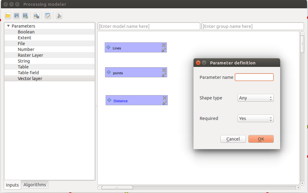
Virtual field

You can make use of a “virtual” field in columns. These are not stored in the data store without the project file and the content is updated as soon as one uses the information depending on the data basing on the field.

virtual fields in QGIS

virtual fields in QGIS


In other words, to create new attributes linked to the warehouse where one does not have write access, or storage you do not want to change. It could also be that you want to do a quick calculation for checking stuff (is there any constituency where the sum of the national parties percent is very low?), but for the sake of creating a lot of new data. A virtual layer disappears as soon QGIS ends, if you do not save the project, of course.
Personally, I think this aspect is one of the best with QGIS 2.6.

Icons for Commands

You can add an image as an icon for a command.

image command

image for command


How useful this is might be debatable, especially when what I can see is only used in the dialog box shown in the image. Maybe it’s supposed to also be displayed when you select the tool in the map, but it does not. At least not in my QGIS build

Functions in the Expression dialog

There has been some functions in expressions dialogue already:

functions in attribute editor

new functions in the editor


The most useful in my opinion is that you can now use the ‘+’ instead of ‘||’ when to merge text strings (pictured above) or concatenate function. The new features include ‘attribute ()’ and $ current feature.

Show / hide object classes separately

You can now turn on and off individual object classes in divided layers.

rule based visibility

rule based layers


Above I use an ‘ELSE’ to catch the unrated items and not to show them on the map. It previously had to make a layer selection to achieve this. Now be as simple as a small ‘click’. Ignition and extinction of classes works with most types of zoning and can be performed even directly in the layer list …

Layer list

Here, there has been a lot of changes, in addition to the ability to show / hide individual layer items. QGIS has now some new buttons in the inventory list, of which the most useful for me is the filter to only include object classes that actually plotted on the map.

layer list

layer list in QGIS 2.6


The same filters are available for printing as well, so now you don’t confuse the users of maps with symbols that are not used in the map itself.

Hide map elements from printing

Let’s say you place a help text in the printing layout. This should not be taken into exports or prints:

hide elements from printing

hide elements from printing


If one else has a finished the map layout but do not always want to have everything on the prints, the function can also be good to have. Would be nice to have: I would have liked to have seen a small mark on the items that are handled in this way, so it becomes clearly visible in the layout. Maybe a little image of a ghost, semi-transparent in one corner.

Empty frames

Now it is possible to mark pages with empty HTML or table borders whether they should be printed with a check box. It is perhaps useful for creating atlases (Atlas). If the map is a very small part of the job and the majority consists of general information obtained from a linked Web site, so it is perhaps unnecessary to print the pages where this link is missing …
A warning though! This can be a source of annoyance if you happen to have a blank HTML frame on the page with this feature enabled. It would probably be better with a warning to the user if a page is not exported, or printed out because of this.

Elements in print

Now there is a list of all the elements included in the print layout.
Here it is possible to hide / unhide or unlock various elements. Additionally you can change by double clicking the name of the element, and you can rearrange the list by dragging-and-dropping the lines in the order you want.

element order map print qgis

element order in map printer


If you do not get any results from prints or exports, it might be good to check this. There might be an empty HTML frame that blocks everything else (see previous section).

Lines and arrows in print

Briefly, more control for them is offered now, thereby providing as much freedom in design you need:

SVG in QGIS 2.6

SVG styler


With SVG option there is no restriction on what can be done in the preview, as long as you can draw your own SVG arrows.

Data Defined override in print

Many properties of map elements can now be linked to the data characteristics itself. This includes, for example, rotation, position, and opacity. Now it is possible to have transparent objects in the print layout like in ESRI ArcGIS? I have to check, because that’s somehow useful any time when to change a map product.

Import Images from URL

The images you want to include in a printed map no longer need a local path. They can be specified now by http addresses.

Printing Tables

You now have much more control on how to print tables on a map.

table properties

table properties


Now you can do a lot more with the tables. For example, you can have a table float out into multiple table frames, or decide in advance how wide columns should be so that these do not happen to cover up something that is important.
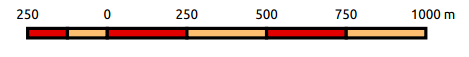
Printing Pt. 2

You can change orientation or rotation of arrows now more easily by holding down the shift key (defined steps). Shift and Alt keys can be used for other items as well: get them plotted expanding from a specified center, instead of a corner.

scale bar QGIS

scale bar


You can also change secondary colors of the scale bar. Feel free to play around. Items can also be moved by given pixel at a time by holding the Alt key while using the arrow keys.

Attach Tolerance in print

The tolerance is stated in pixel now.

pixel tolerance

pixel tolerance for print items


It becomes easier to manage snapping when you use the zoom function in layout.

Overview Maps

An overview map can have many marked detail maps now.

overview maps

overview maps


This is one of my favourite new features in QGIS 2.6 as well. In the picture above, I have changed the color of the marker and frames so that it will be easier to identify which map is available. If you do not like the semi-transparent color blocks, you can select polygons with only an outline too.

HTML frames

It is now possible to manually enter a HTML source code in the HTML frame.

HTML in map view

HTML expressions


You can also build expressions to create dynamic HTML sources. If you want, you can use special QGIS expression directly in the code, for example by creating expressions. The image above is an expression to print the current year.

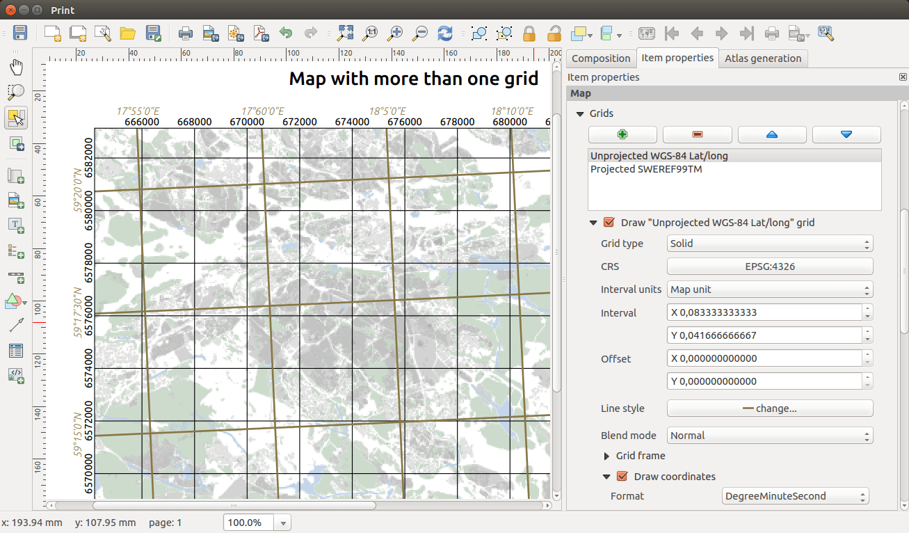
Several coordinate systems/nets on the map

My absolute favorite is the opportunity to have lots of grid based on different coordinate net on a single map. This is standard for the big Redland GIS software and has it’s place in QGIS now as well. Unfortunately I’m still waiting to simplify printed coordinates so that you can get get rid of some zeroes.

qgis map coordinate system

new coordinate systems in QGIS map composer

This is on the way, but it requires that a number of other problems are eliminated first, so be patient. Do not want to wait that long? Then you can contact QGIS project and go in as a sponsor for this function and thereby speed up the work.

Download tool online

Now you can connect to an online library of several scripts directly from QGIS.

code library qgis

code library


This library will be updated by the users themselves. The management seems to be much like it works for plugins.
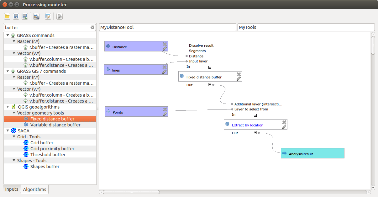
New Model Builder

The Model Builder is completely reworked, but the new one is backwards compatible.

new model builder in QGIS 2.6

new model builder in QGIS 2.6


Modeller and scripts made QGIS very adaptable for special needs. There are some dependencies that must be taken into account sometimes, because some scripts require different add-ons are installed and enabled, but on the whole there is a lot of time to win if you repeatedly perform similar tasks using models instead of “click”.

Syntax Highlighter

It appeared in a picture before, where the html code occurred, that QGIS now helps you to keep track of code using colors and text styles. This makes scripting and programming in QGIS much easier.

syntax highlight in QGIS

syntax highlight in QGIS


You will also get support on Python syntax and you will get help while writing code via a pop-up.
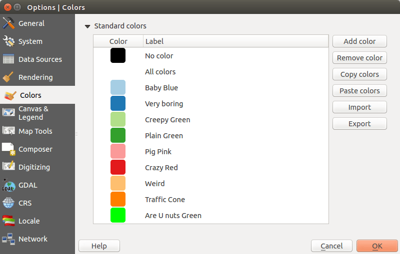
Managing Colors

This is also one of the nicer updates.

color management

color management in QGIS 2.6


Now you can choose colors in a lot of different ways. Especially good: you can choose to capture a color from any part of the screen, not just from the QGIS application: Images or documents on a website can provide the colors you would like to use with an ease. So no more rgb code short term remembering ;-).
You can even create your own palettes where the colors are named in the project and the program itself. These palettes can of course be saved as a file and opened in another QGIS instance. There is also a new very nice color selector with a context menu which includes recently used colors listed.
color options in qgis 2.6

color options in QGIS 2.6


Projects or program palettes will be displayed here as well. A great tool!

Select Items

The former two buttons have become one button. When you need to select an item in the map you can do it with a click, or click-drag a square. The same tool for two functions. FTW!

Add to Map

Many processes create new layers in QGIS. By default, these will now be added to your inventory list.
Previously it was a choice that had to be done in nearly every plugin, is now standard. If you do not want to add the new layer to the map, you can uncheck the option in the current dialog.

Large Icons

For some reasons it might be needed: QGIS now supports unnecessarily large icons.

large Icons QGIS

large icons in QGIS


Especially useful if you use the touch-screen on a mobile device with QGIS for Android. As seen in the picture, it’s not all the icons that automatically gets bigger. It probably depends on the used plugin/functionality.

Identify

If you use the right mouse button with the identify tool you get a new menu ;-)

identify tool qgis

new identify tool


Instead of getting all the hits for the selected layer, you get a list of all identifiable layer hits. You can still ‘Identify all’, but you can already reduce the selection to something more manageable.
Oops! It appears my icon that I explained earlier. If there is a command linked to the layer you can choose whether to run it instead of ‘Identify’.
A few steps from the menu in the picture disappear when you right-click on a single item, but the principle is the same.
The ‘new’ identify tool is also on my favorite list of new features in QGIS 2.6.

Top Features

Phew!
It may not be so spectacular, however, the functionality of these features is extremely appreciated.
If you have someone nearby who helped make QGIS 2.6 to the impressive software it is, give it a big hug from me!
There are six favorites that ends up on my list of news.

  • Several coordinate nets on printed maps
  • Color management
  • Use only selected data for joins
  • Virtual fields in tables
  • Identify tool: right-click menu
  • Show / hide object classes separately

What are your favorites?

-see the original article on Klas’ blog geosupportsystem (swedish)

The post QGIS 2.6: insights appeared first on Digital Geography.

Amazing styling in QGIS 2.6

$
0
0

Since QGIS 2.6 was released with a lot of new features and functions I’ve been testing it sporadic and have come to realise that the quality and functionality of symbol styling and labelling is so high that ESRI ArcMap no longer can match it. Honestly I haven’t tested the 10.3 version of ArcMap, so my experience is based on previous versions.

Here I’ll use an example to highlight some of the extensive possibilities offered in QGIS.

I’ll be using “live” earthquake data from USGS in GeoJSON format and if you want to know how this is done you can find an article on it in my blogg (in Swedish). Oh, by the way. I’ll also be using Open Street Map as a background for simplicity.

In the image above all registered earthquakes the past seven days are visible. You can get other time periods as well if you want to, but this suites me perfectly.

Earthquakes can be of different type and as the complete amateur I am on the subject, my assumptions may be incorrect, in which case I apologise. The attributes I’ve chosen to highlight are:

  • Magnitude – the strength of the quake.
  • How “significant” the quake is (attribute).
  • Is there a risk for a Tsunami (attribute).

In the attribute table more attributes are available, but I’ll settle for these.

I’ll also use two attributes for labelling, magnitude as simple text and a prepared longer text attribute.

First of all I’ll create a base symbol. A simple marker with red fill and red outline…

Wait a minute! That doesn’t work, does it?

Yes, it does! With the new colour picker it’s easy to set transparency for each individual colour in a single symbol ( “sweet” ). Here I’ve chosen 50% transparency on the fill, and then an overall transparency of 25% (hidden behind the dialogue in the picture above). This gives me a nice symbol with a fill colour more transparent than the outline.

I won’t be using the single symbol styling, but it’s a quick way to test a concept. I do however want to use my symbol so in the dialogue I press “Save”, to save it to my symbol library.

I’ll be using Graduated styling based on how significant the quakes are. I use my saved symbol as a starting point and a custom colour ramp that goes from red to red, from more to less transparency. Yes, you can have different transparency in a single colour ramp!

Using “Pretty Breaks the data is classified into four classes where less transparent features are more significant than the more transparent.

To amplify the effect I’ll also change the thickness of the symbol outline, so that less significant quakes gets a thinner outline.

I’m using the magnitude to control the size of the symbol by using an expression. Size field, or expression, is set under the button “Advanced” (hidden under the expression builder dialogue in the picture above). I chose to multiply the magnitude with it self to point out that the Richter scale is not linear, thus giving larger quakes more importance.

To symbolise Tsunami warnings it’s simplest to create a layer copy and change the styling of that layer. It is possible to create very complex rule-based styles, but if you do, you loose the possibility to set size to an attribute (I think).

First of all I’ll limit the features by a feature subset using the query builder in the general tab. Setting “tsunami” = ‘1’ will filter the uninteresting features out.

As a symbol I start with my saved symbol but change it to three large blue rings, gradually thinner and more transparent ( I love this! ). The size is dictated by the magnitude, the same way as before.

The result is pretty clear, even if there are a lot of overlapping symbols in the map right now.

Next, labels:

I want different labels for medium and large quakes, while the smaller ones will have no label. What is classified as a large or small quake can be debated, but here I’ll set the limits at 6 and 4.5.

The text for the labels will be collected from an expression (the dialogue bottom left in the image above), where the attribute “title” will be used if the magnitude is greater than 6, and if that isn’t the case the attribute “mag” will be used for quakes larger than 4.5.

Simple numbers I want printed on top of the points, but long texts should be printed out to the right. This is solved by a data defined override (yellow button in the centre of the image above) and an expression similar to the previous (dialogue bottom right in image above). Here the value “4” (center) or “5” (right) is assigned depending on magnitude. What values to use is shown when the mouse hovers over the button.

You can override the rendering rules and show all labels including those that overlap with a simple check box (image above). I don’t want this, but I do want to make sure the large quakes always are labelled. This is done by yet another data defined override which in this case forces the label to print, if the magnitude is greater than 5.

In the picture above I’ve tweaked the settings for buffer and shadow, as well as their separate transparencies. I also changed the values some in order to show all differences at the same time.

I’m really happy with the result that shows registered earthquakes the past seven days by magnitude (size), significance (transparency) and risk for tsunami (blue rings). Considering I’ve only just touched on the possibilities regarding styling in QGIS I’m pretty convinced QGIS, in this regard, is superior to ESRI ArcMap.

What do you think?

The post Amazing styling in QGIS 2.6 appeared first on Digital Geography.

Viewing all 87 articles
Browse latest View live